
Digital Marketing · Case Study
The Azure Retreat campaign.
Turning a beautiful but overlooked hotel into a brand people actually wanted to book.
Background
The Azure Retreat is a boutique hotel with beautiful rooms and a quiet problem. Too few people knew it existed.
The property had almost everything a guest could want. A striking location, well designed suites and real warmth in its service. What it did not have was a presence that matched. Its social media was occasional and inconsistent, and its advertising had never been given a real strategy. In a market where people choose with their eyes, that gap was quietly costing bookings.
I was brought in to design and run a marketing campaign that would do more than raise awareness. It needed to turn attention into filled rooms, and to do it inside a single season.
The challenge
Beautiful, but invisible, and up against louder names.
The hotel sat in a crowded market where larger brands spent freely and posted constantly. The Azure Retreat could not outspend them, so it had to be sharper. The challenge came in three parts. Build recognition quickly, make the brand feel genuinely premium rather than generic, and produce measurable enquiries rather than vague engagement.
There was also time pressure. The results needed to show inside roughly a month, not across a slow year of brand building.
Discovery
What I learned before spending anything on ads.
I studied how comparable hotels presented themselves and where they were weak. Most looked the same. The same stock style photos, the same discount language, the same crowded feeds. Guests were not short of options. They were short of reasons to feel something.
I also looked at who books stays like this, and why. The pattern was clear. People were buying an experience and a sense of arrival, not a room rate. That told me the campaign should sell atmosphere and certainty, not price.
My thinking
Sell the feeling of arriving, then remove every reason to hesitate.
I decided the campaign would lead with mood and craft rather than offers. If the creative could make someone feel the calm of walking into that lobby, the booking argument was already half won. Discounts attract the wrong guest and teach an audience to wait for the next one. Desire, shown well, does the opposite.
The second decision was discipline. A premium brand is built through consistency, so every post, story and advert would share one visual language, one tone and one clear next step. Nothing random. Nothing off brand.
Strategy
One look, one voice, and a clear path from feed to booking.
I built the campaign on three pillars.
One · Positioning
Present The Azure Retreat as a calm, elevated escape, defined by atmosphere rather than price.
Two · Creative system
A single premium visual language across posts, stories and paid ads, so the brand looked unmistakably itself everywhere it appeared.
Three · Conversion
Point every piece toward one simple action, enquire or book, with as few steps in between as possible.
Organic content built familiarity and trust. Paid advertising carried the brand to new guests. Both spoke with the same voice.
Process
How the campaign was produced and run.
I developed the concept and art direction first, then produced a full set of images and graphics for ads, feed posts and stories. Each format was designed for its place rather than carelessly resized from a single master.
I wrote a caption library in a consistent voice, then built a publishing calendar that balanced mood, proof and clear invitations to book. Paid campaigns were set up to reach lookalike and intent based audiences, and watched closely so that budget moved toward whatever was working.
Throughout, I kept the system tidy enough to be handed over and continued, rather than abandoned the moment the campaign ended.
Deliverables
What the hotel received.
A campaign concept and art direction
A complete premium creative set for ads, posts and stories
A caption library written in one consistent brand voice
A publishing calendar for the campaign period
Paid advertising setup, targeting and ongoing optimisation
A reusable content system the team could keep running
Sample captions
The voice, on the page.
“Some views don’t need a filter. Golden hour at The Azure Retreat. Book your escape — link in bio.”
“Every detail, considered. From the linen thread count to the last drop of your evening cocktail. This is Azure standard.”
“The best seat in the house doesn’t have a number. It has a view. Reserve your suite today.”
“Quiet luxury isn’t a trend here. It’s Tuesday. Discover The Azure Retreat.”
“Book direct and we’ll take care of the rest — private rate, no middleman. Offer ends soon.”
“This is what ‘you’ve arrived’ actually looks like. Welcome to The Azure Retreat.”
Evidence
The creative, in full.
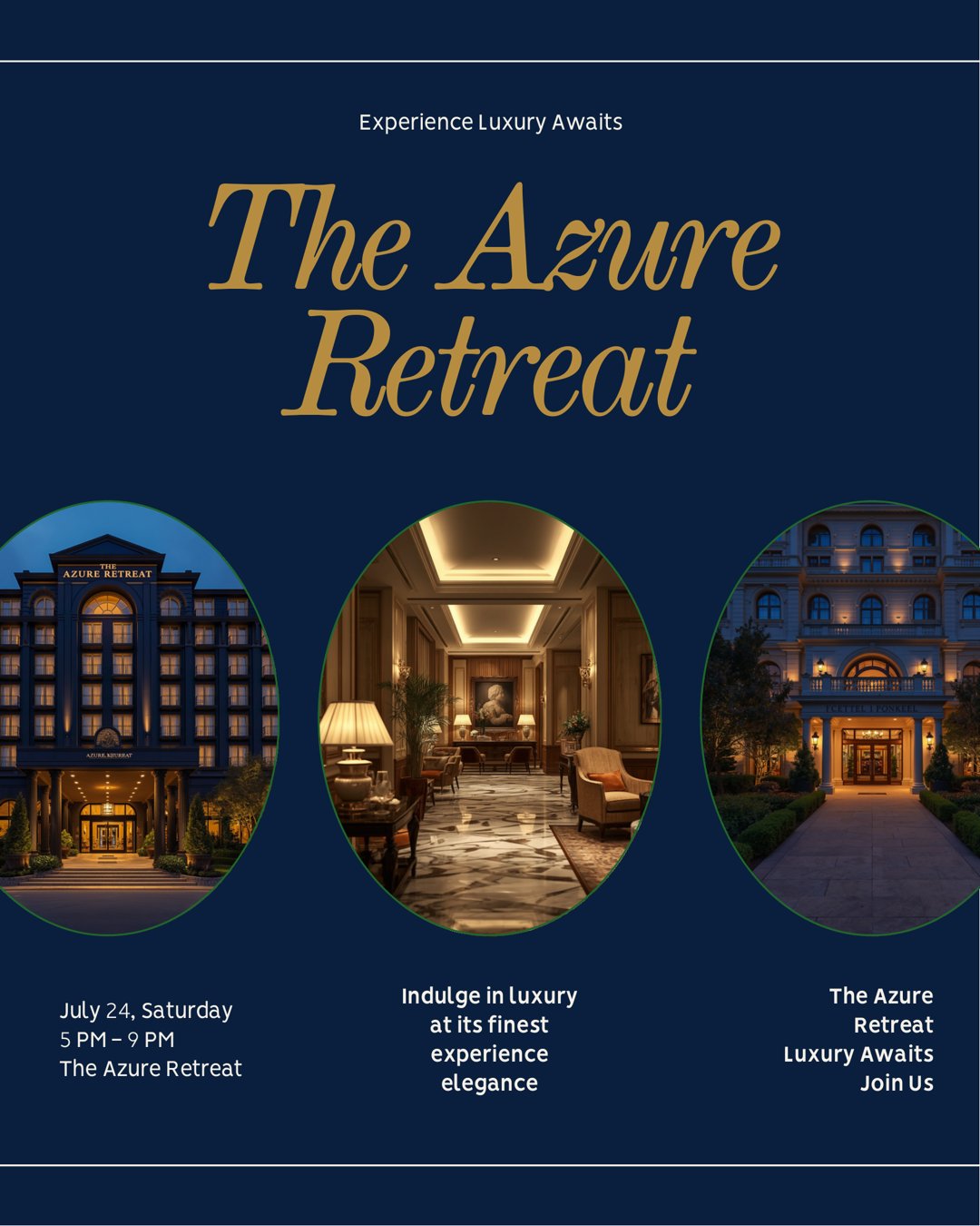
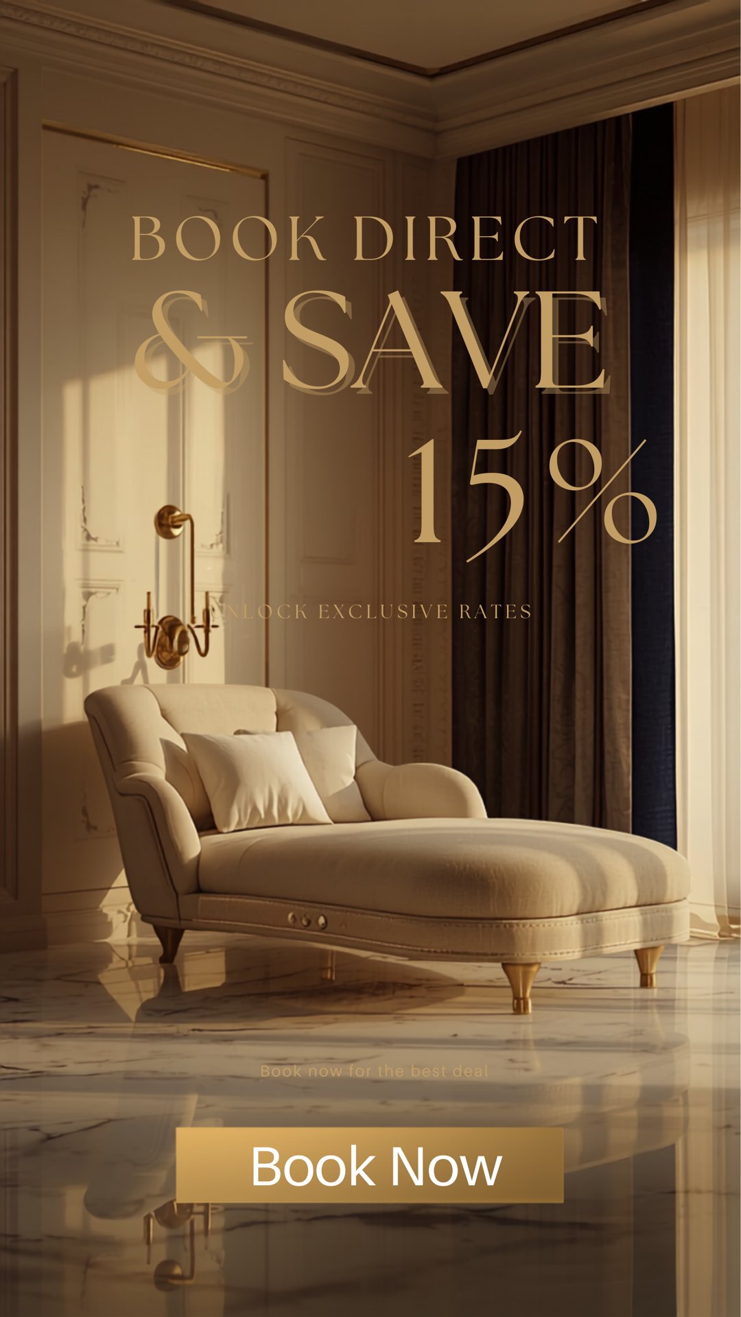
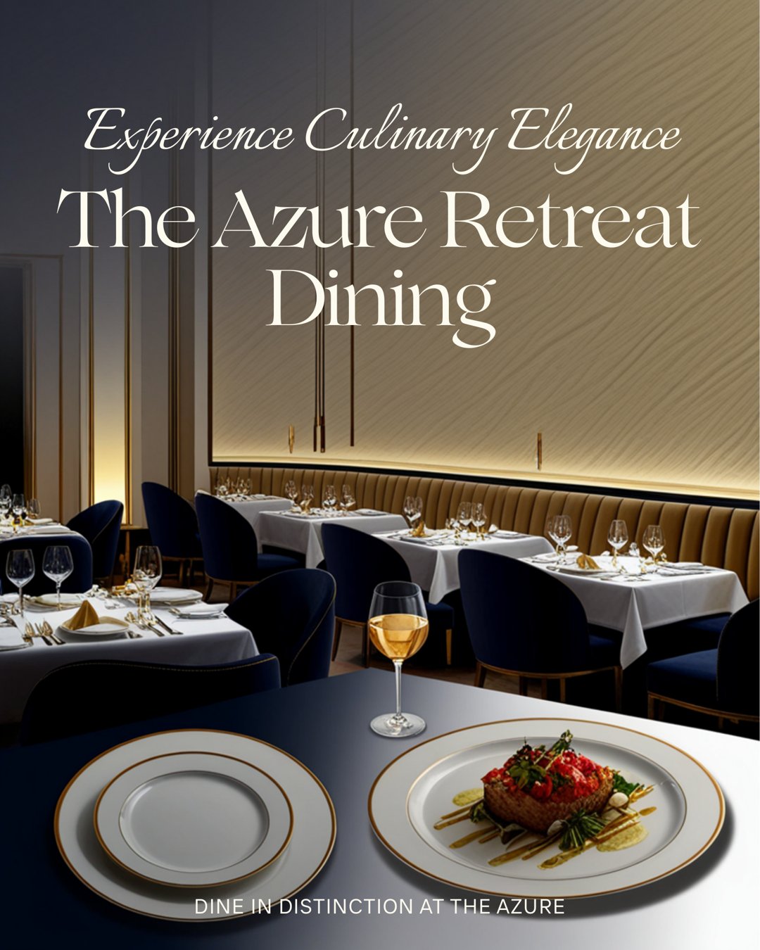
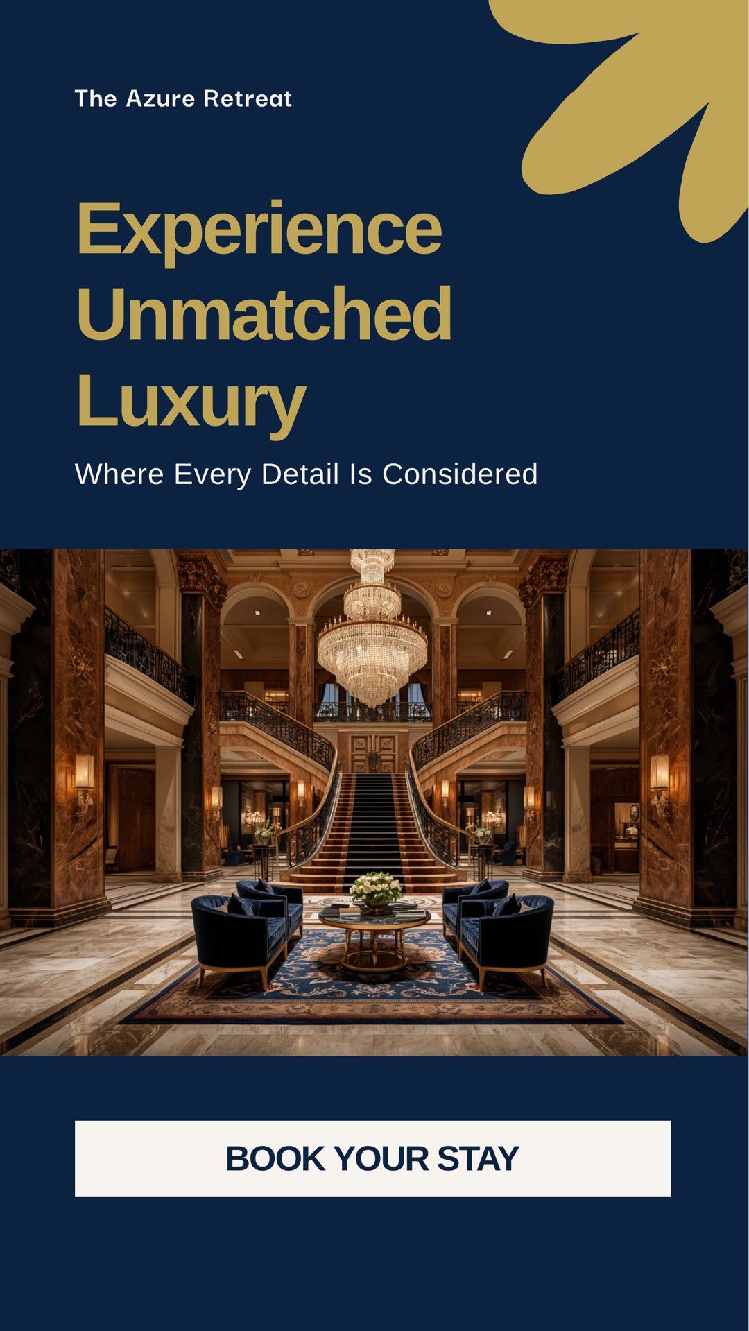
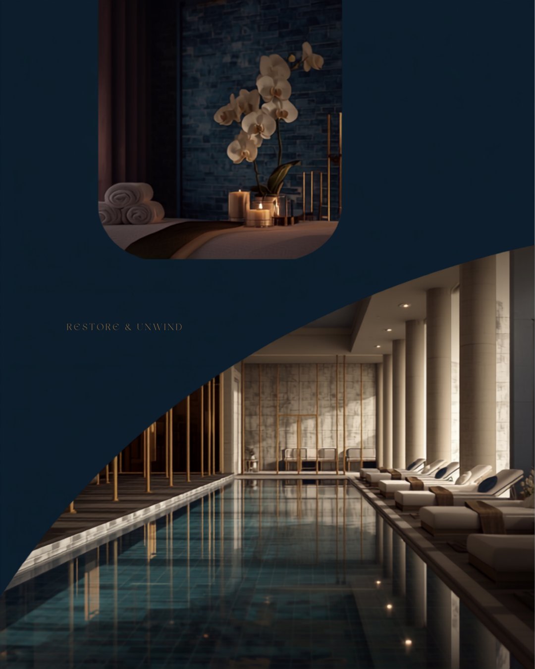
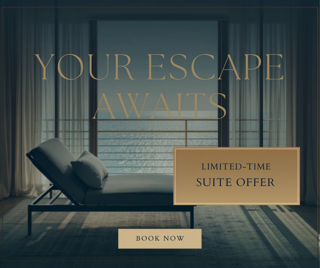
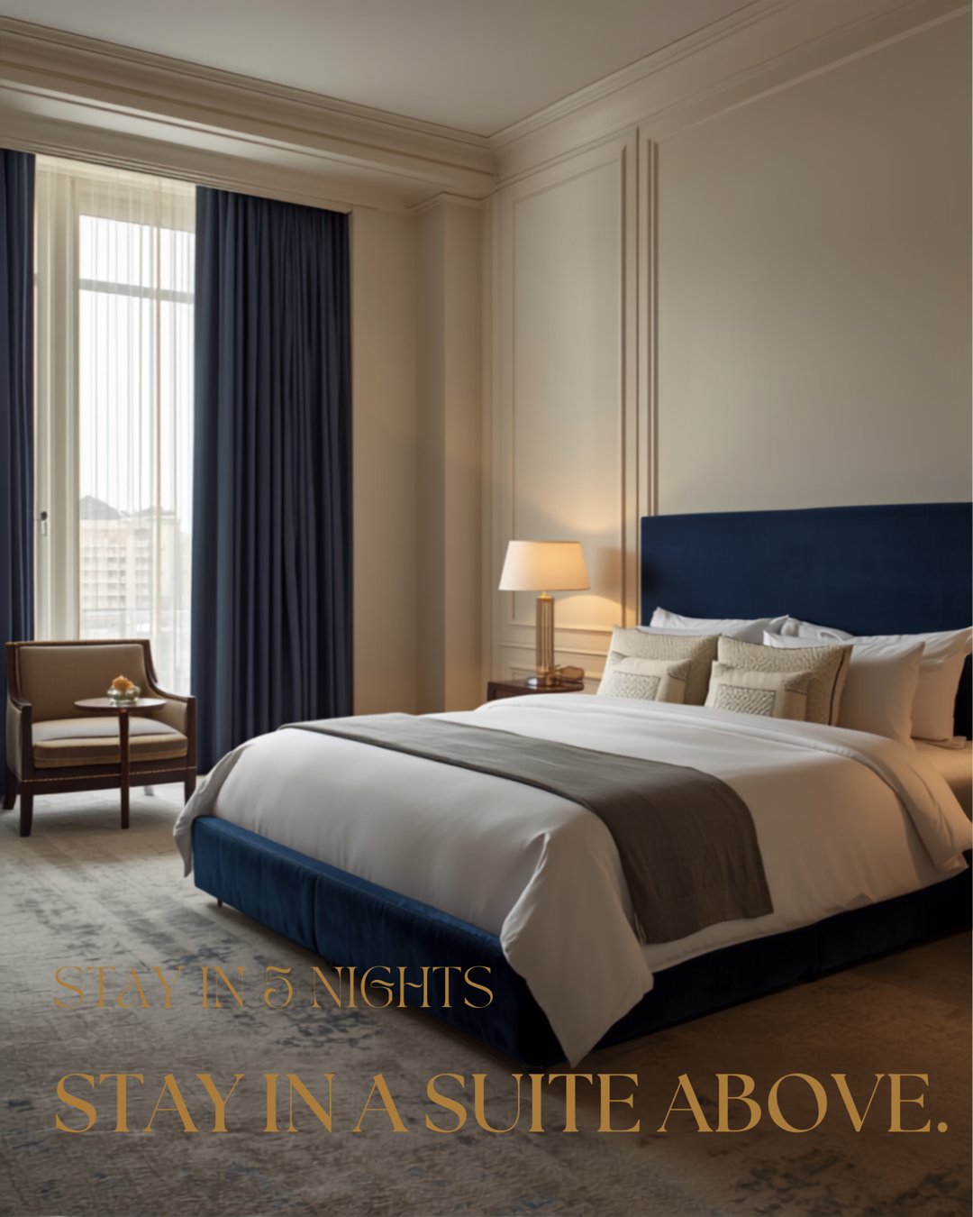
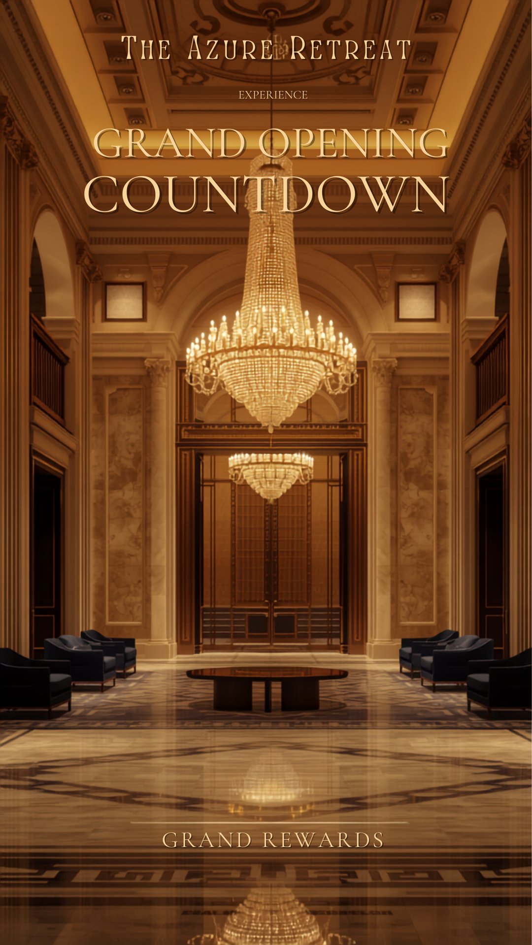
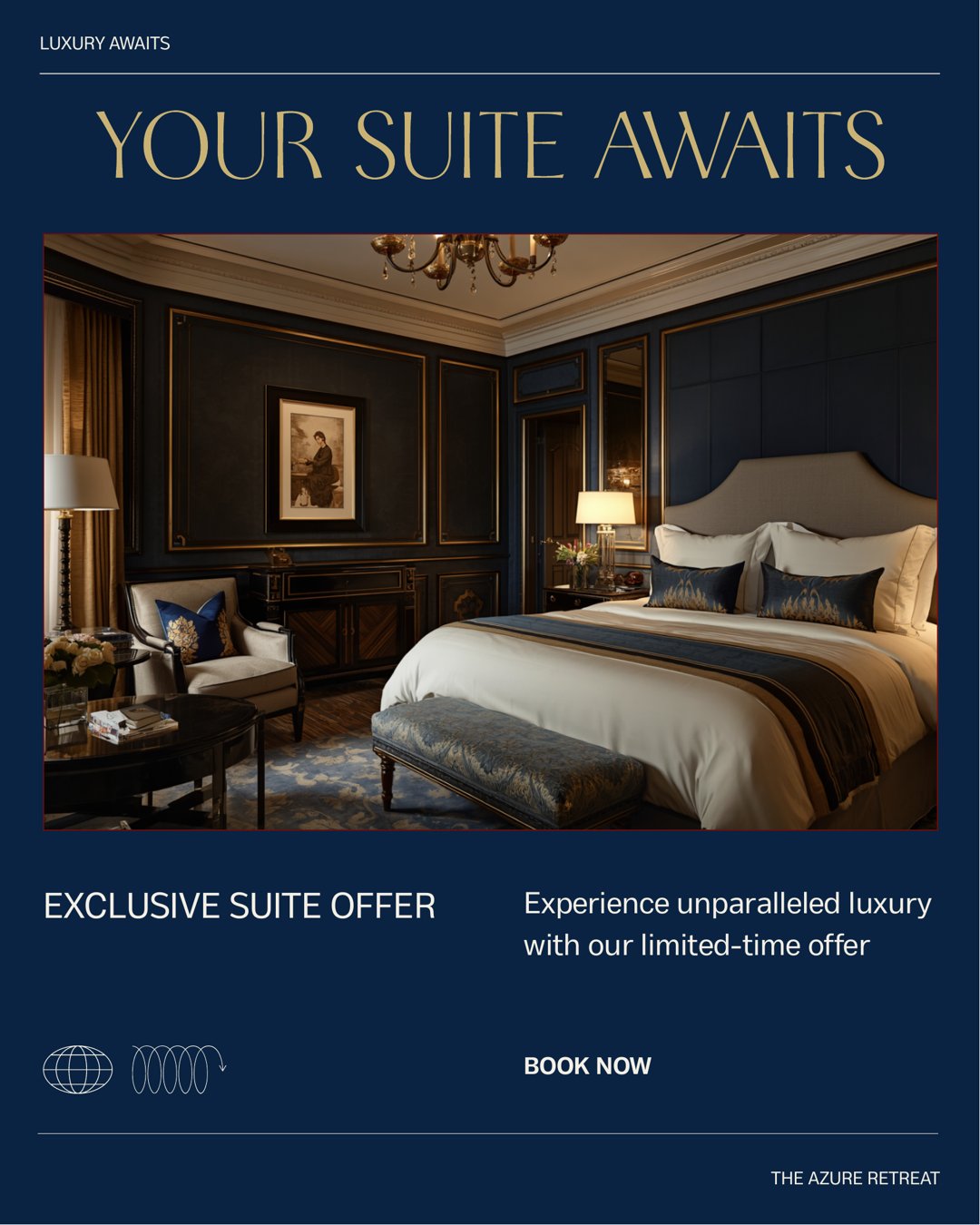
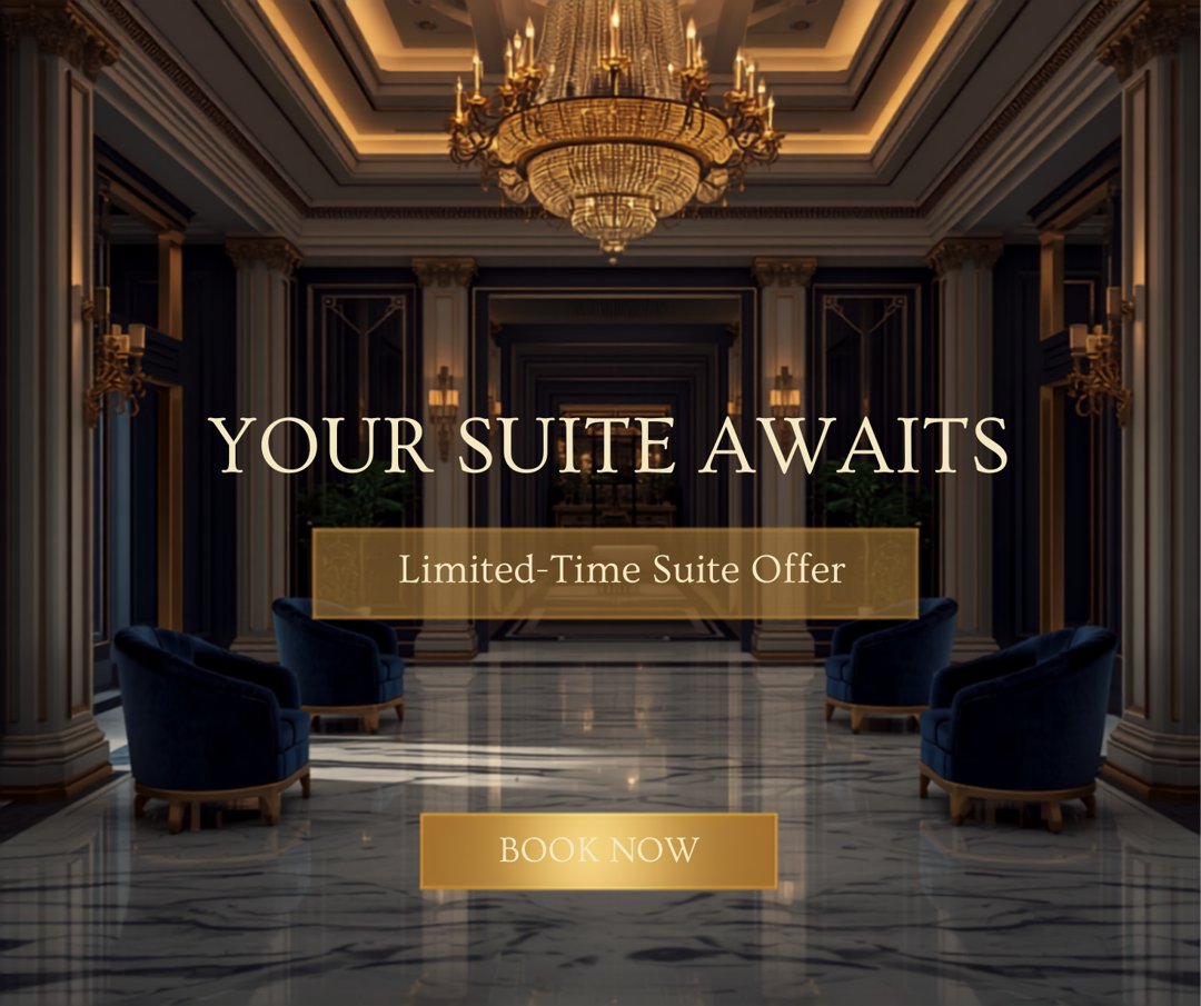
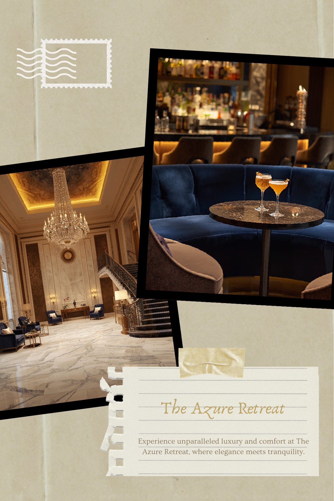
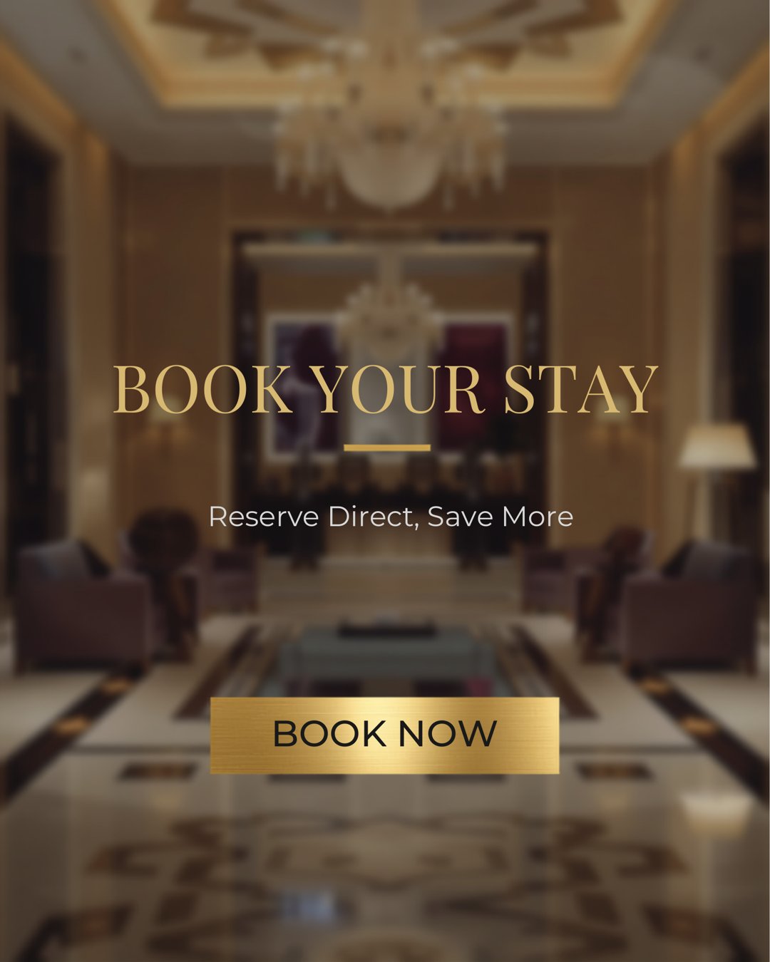
Feed posts, carousels, stories, a reel cover and paid ad units, all built on one grid and one colour grade. Every asset here was designed for this campaign.
Outcome
Measured against clear targets.
As a launch campaign, results are tracked as target KPIs and a reporting cadence rather than historical data:
Awareness
Follower growth rate, accounts reached, impressions.
Engagement
Average engagement rate, saves and shares.
Traffic
Link clicks to the booking page, story swipe-up / tap-through rate.
Conversion
Direct booking inquiries attributed to social; ad spend vs. direct booking revenue (ROAS).
Brand health
Branded hashtag / mention volume, and UGC volume.
Reporting cadence: weekly dashboard during the four-week launch, monthly thereafter, with a full retrospective at week 4 comparing actuals to targets.
Reflection
What this campaign confirmed for me.
In hospitality, taste is a growth strategy. The hotel did not need to shout. It needed to look like the experience it was actually offering, consistently enough to be believed.
It also showed the value of restraint. By refusing to lead with discounts, the brand drew guests who valued the experience and were happy to pay for it. That is a far healthier foundation than a race to the lowest price.
Lessons learned
What I carry into the next campaign.
Consistency is the campaign. A single strong look, repeated with discipline, beat scattered creativity every time.
Sell the feeling, not the price. Desire converts better than discounts, and it protects the brand while it does.
Make the next step obvious. Attention is wasted when the path to booking is unclear, so the simplest possible route from interest to enquiry mattered as much as the creative.
What the client said
“
When we first reached out to Anita, we knew the hotel wasn’t performing, but we didn’t know what to do. She didn’t jump straight into execution. She first took the time to evaluate the business and gave us practical advice on what needed to change. That advice became the foundation for everything that followed.
She rebuilt our website, completely transformed our online presence, handled our commercial photography and videography, took over our social media, and managed our advertising campaigns. The difference was remarkable. We went from struggling to attract guests to having the hotel constantly fully booked.
What impressed me most wasn’t just the marketing. It was her ability to understand the business itself and recommend solutions that actually worked. She became much more than a service provider; she became someone we trusted whenever we needed to make business decisions.
Olaniyi Obafemi
Hotel Owner
Work with me
If your brand looks smaller than it actually is, that is fixable.